Packaging
Skincare Packaging Concept
A packaging direction for a small skincare range, designed to feel calm, natural and premium on the shelf.
About this project
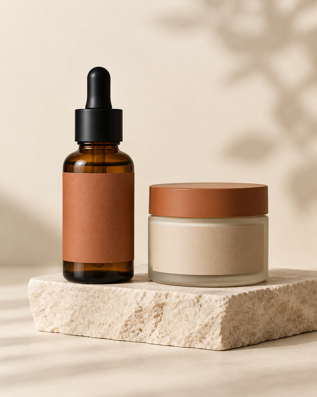
Amber glass and frosted jars carry the product; the design work happens in the labels. Warm terracotta and beige paper labels keep the set reading as one family while the different formats stay clearly distinguishable.
The label architecture leaves generous space — hierarchy comes from position and scale rather than ornament, so the range can grow to new products without redesign.
What's included
- Dropper bottle and jar label layouts
- Color-coded product range system
- Typography and hierarchy guidelines
- Mockup presentation for manufacturer briefings