Branding
Brand Stationery System
A stationery system that turns a simple leaf monogram into a complete, coherent brand identity.
About this project
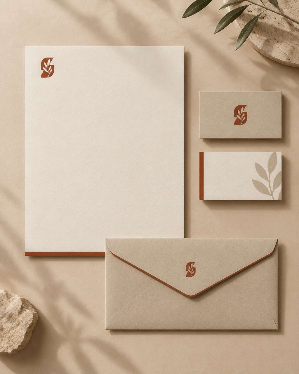
The identity is built on quiet contrast: warm off-white paper, a muted kraft envelope, and a single terracotta accent that appears exactly once on every piece.
A botanical mark bridges the items — solid on the letterhead, tonal on the reverse card — so the system feels intentional rather than repeated. Proportions, margins and accent placement follow one consistent grid.
What's included
- Letterhead, business card and envelope layouts
- Solid and tonal mark variations
- Terracotta accent and kraft paper palette
- Print-ready layout specifications